Mục lục 1. What Style Should an Amusement Park Website Interface Follow?2. What Are the Must-Have Sections on the Homepage?3. How to…

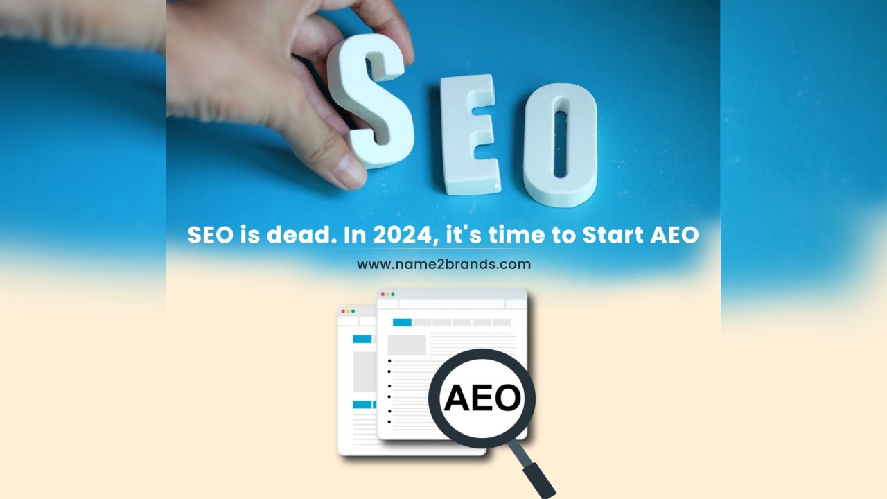
Mục lục What is AEO (Answer Engine Optimize) service?The Nature of AEO:Effective AEO Methods:Concrete Example of AEO: What is AEO (Answer Engine…
Mục lục 1. What is an Online Securities Training Academy?2. Strategic Benefits of Integrating an Online Training Academy3. Core Functional Modules of…

Mục lục 1. What is an AI Agent?2. How does an AI Agent work?3. How is an AI Agent different from traditional…
Mục lục
The website interface of an amusement park isn’t just about visual appeal – it’s a powerful tool to trigger emotions and increase conversion. An effective design helps users say “wow”, immediately understand the services, and complete their booking with ease.
You only have 5 seconds to make a first impression. A poor design drives customers away. A well-crafted one drives revenue. Let’s explore the insights below with Wecan Group!
The interface should use vibrant, playful colors that inspire joy – appealing to children, families, and young adults.
Vivid colors with high contrast
Use bright tones like sunny yellow, cherry red, and mint green to stimulate visual excitement.
Example: White background + Red buttons + Green headings = Eye-catching from first glance.
🟡🔴🟢 → Creates a feeling of “Excitement – Energy – Fun”
Large, easy-to-read fonts
Use rounded fonts like Poppins, Baloo, or Nunito Sans — friendly to both kids and older adults.
Font size: Minimum 16px for text, 24–32px for headlines.
Example: “Discover now 🎡” stands out more than “Click here”.
Playful animations
Add subtle interactions: button pulses on hover, shaking icons, games appearing on scroll. Avoid overcomplicated effects that distract.
Example: A “Buy Tickets” button that softly glows if inactive for 5 seconds.
Authentic, emotional imagery
Real photos boost trust and evoke the desire to visit.
Prioritize happy children, families playing, and live games in action. Avoid generic stock photos.
Add captions: “Slide zone – Area A – Photo taken in June 2025.”
Wecan Group Insights
From our work on projects like Sun World’s online booking system, we know the interface shouldn’t just be “beautiful” — it must align with your park’s core service model.
Wecan categorizes designs into 3 common models:
Water Parks
Indoor Entertainment Complexes
Themed Parks
Wecan’s Core Philosophy
In the first 5–7 seconds, users must understand:
Wecan Group recommends structuring the homepage around 6 key blocks:
Memorable Header – Brand at First Sight
Example: “Kids Planet” has a yellow “Book Now 🎉” button top-right.
Eye-Catching Banner – Instant Emotional Appeal
Suggestion: Use drone footage with laughter and splashing sounds.
Highlights Block – Reasons to visit
Show as icon + real photo + short title, for example: “High-Speed Water Slide – from just 80K”
Strong Call-to-Action
Example: Button “📍Find Park Location” opens Google Maps in a modal.
Quick Info Section – Real Questions, Real Answers
Suggestion: “Open: 8:00–18:00 | Adults: 120K | Kids: 80K”
Complete Footer
Example: 📞 “Hotline: 0909 123 456 – Chat on Zalo”
Tips from Wecan Group:
Your homepage should act like a landing page – helping users understand – get excited – act now, without needing to scroll endlessly.
Adopt a mobile-first design with a simple layout, large buttons, easy interactions, and fast loading speed – this is essential when 70–80% of visitors to amusement park websites come from mobile devices.
Mobile-first Design Principles
Example: Show the “Book Tickets – Promotions – Opening Hours” section immediately when the page loads.
Large Buttons – Easy to Tap with Fingers
Tip: The “Book Now” button should take up 80–90% of the screen width and be in a standout color.
Icon-based or Slide-out Menu (Hamburger Menu)
Example: Use the “🎟️” icon for the “Buy Tickets” section to improve recognition compared to plain text.
Optimize Loading Speed – Under 3 Seconds
Real-world example: A large animated banner can cause visitors to leave before seeing your promotions.
Vertical Content Layout – Minimal & Clear
Tip: Instead of writing “Group Ticket Discount for 4 People” → use 👨👩👧👦 along with the price.
Wecan Group’s Approach
For projects like Sun World, seaside entertainment complexes, and indoor amusement parks, Wecan Group always:
It’s not enough for the interface to look good – a mobile interface must spark excitement, drive action, and convert right from the first screen.
The answer: Yes – if you want to keep visitors engaged and convince them directly on your website.
How Wecan Group Implements This:
Interactive On-site Map
More than just embedding Google Maps – Wecan designs fully customized interactive maps:
Smart Ticket Booking System
No default plugins – Wecan develops custom booking module:
Realistic Experience Simulation
Not just single 360° photos – Wecan implements scripted Virtual Tours:
Even with full features, these 5 design mistakes can silently “drain” your visitor numbers:
Visitors to amusement park websites aren’t just looking for information – they want to know: “Will this be fun?”
Wecan Tip: se real photos of guests enjoying the park, add light animations, short authentic customer quotes, and create layouts that feel like a journey of discovery.
Many websites force users to:
Wecan Tip: Reverse the UX flow: Highlight promotions first → Suggest combos → Then showcase attractions.
Websites often lack:
→ Without these, trust drops – especially for new guests or families.
Wecan Tip: Show tags like “2,300+ families have visited,” embed real TikTok videos, and integrate Google Maps reviews.
Websites fail to create the sense of “buy now or miss out”:
Wecan Tip: Add live alerts like “Only 18 promo tickets left today” or “3-ride combo offer ends in 24 hours”.
Wecan Tip: Craft messages targeting parents – highlighting convenience, trust, and the emotional reward of giving their children a great day out.
Contact Wecan Group Experts at 098.44.66.909 (Mr. Nam) to:
